
Design
Integrity
Audit.
We dismantle digital interfaces to identify the precise moment where brand intent meets user friction. Our audit is not a checklist; it is a clinical verification of aesthetic and functional coherence in the London tech landscape.
Identifying the micro-stutters that erode platform authority.
Visual friction is rarely about a single broken link. It is the cumulative weight of inconsistent padding, mismatched type scales, and interaction feedback loops that lack physical logic. In high-stakes environments—from fintech dashboards to luxury retail—these micro-stutters translate directly to a loss of user trust.
Our process isolates these "design debts." We look for structural weaknesses in the CSS architecture that cause layout shifts and scrutinize the psychology of white space to ensure your core value proposition isn't buried in cognitive noise.
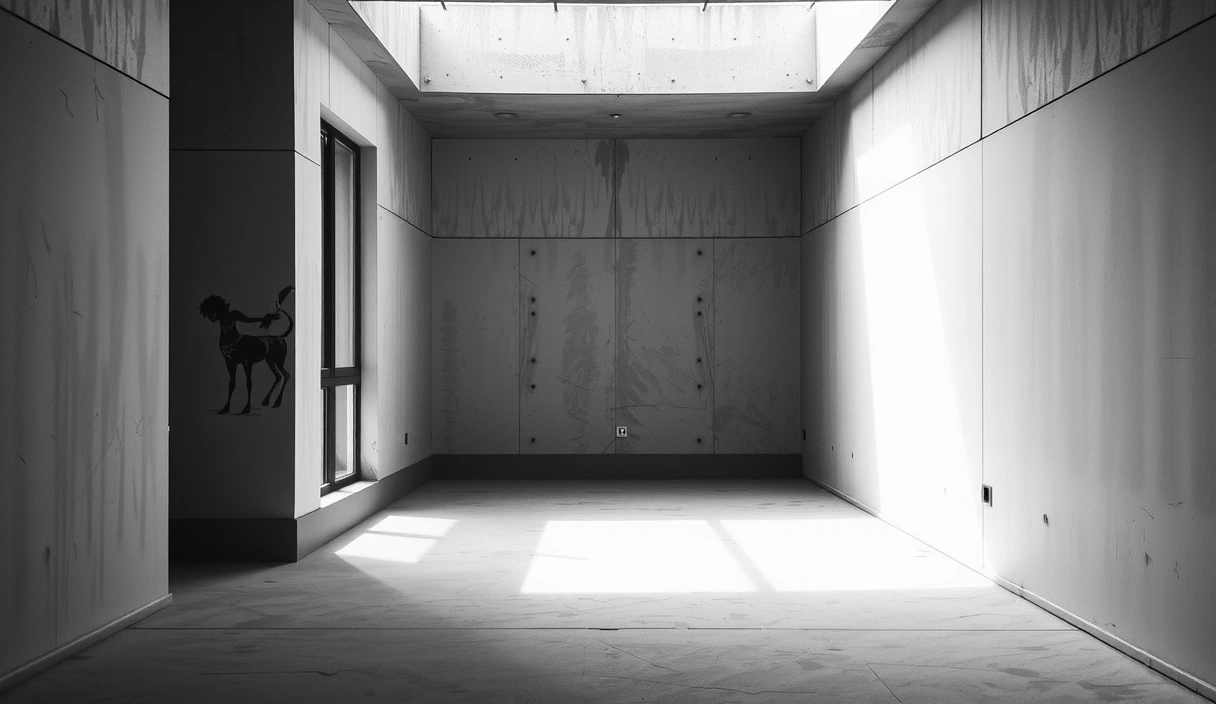
Fig 1.1 — Spatial logic and structural tension in interface layout.
Verification
Thresholds.
We audit the underlying CSS structure for scalability. Bloated styling and redundant breakpoints are categorized as technical debt that compromises long-term performance and search engine ranking.
Using heuristic evaluation criteria, we measure how quickly a user can navigate complex information architecture. If a design requires more than 1.2 seconds of thought to determine the next step, it fails the audit.
Analysis of font pairing and hierarchy. We verify that secondary typefaces support the brand voice without competing for ocular dominance. Hierarchy is a prerequisite for retention.
Strict adherence to WCAG 2.1 AA standards. We audit color contrast ratios, screen reader compatibility, and interactive target sizes to ensure the digital space is truly inclusive.
Verification of authenticity. We evaluate the impact of photography on long-term credibility, favoring custom editorial assets over generic stock imagery that dilutes brand authority.
Scrutiny of interaction loops. Every hover state and click transition must provide immediate, predictable feedback. Ambiguity in the interface is the precursor to abandonment.
The trade-off between
speed and perfection.

Phase: Calibration
We treat interface design as a mechanical assembly. Each element must serve a functional purpose; decorative fluff is systematically identified and suggested for removal to preserve performance.

Phase: Elimination
Intentional negative space is our primary navigation tool. A design audit often reveals that what is missing is as critical to the user journey as what is present. Clarity is the absence of noise.
Responsive
Integrity Check.
A design that fails on a mobile device is a design that fails fundamentally. We verify "liquid" layouts that maintain their aesthetic intent regardless of the viewport dimensions.
01 Analysis
We map the information architecture against user search intent. We look for discrepancies between what the brand communicates and what the interface facilitates.
02 Refinement
Editorial standards for content are applied. We ensure the tone of voice is mirrored in the visual weight of the typography, creating a singular narrative.


03 Final Report
The audit concludes with a pragmatic roadmap. We separate 'fast-fashion' design trends from sustainable, future-proof interface decisions based on data-informed refinement.
Is your interface holding you back?
Most digital platforms suffer from aesthetic drift. We provide the surgical clarity needed to realign your product with its original intent.